

2025 Texture Guide: Elevating Brand Harmony
Have you ever felt like your brand’s visual identity is missing a certain depth or dimension? Like, you’ve got all these brand colors laid out, and they look great, but there’s just something… flat about it? Welcome to the world of texture style in brand design and how, by playing with the texture mix, you can elevate your visual communication game. So let’s dive in and explore how you can give your brand that extra oomph with textures that make everything feel more authentic and, well, alive.
Why Texture Matters in 2025
Here’s the thing—brands are no longer just about colors and logos. (Nope, we’re past that point.) We are venturing into a time where rhythm and touch in visual and digital realms completely redefine brand identity. Enter texture. Texture isn’t merely a pretty design feature; it shapes how we interact with—and feel about—brands at a visceral level. As 2025 is ushering in new trends, understanding the importance of texture and its harmony with brand colors is crucial. Trust me, truly integrating texture style can create a captivating narrative for your brand.
Texture and Color: A Dynamic Duo
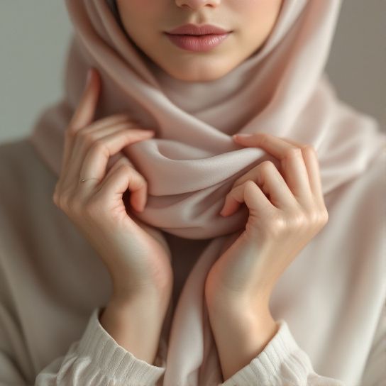
Textures and colors, when combined thoughtfully, speak a language that is visually engaging and emotionally compelling. Visual textures give your designs depth, create contrast, and add a sensory layer to otherwise flat colors. Think of it like this: your brand colors are the bones, and texture adds the flesh. When done right, they blend into a kaleidoscope of richness that draws people in, making your brand feel tangible and impactful.
Common Problems Solved with Textures:
- Monotony: Single-tone designs can feel repetitive. Textures introduce an element of surprise and freshness.
- Lack of Dimension: Flat designs can lack depth. Texture adds layering to signify depth.
- Engagement: Plain visuals might not invite much interaction. Textures induce curiosity and invite exploration.
Unraveling Texture Styles
Alright, let’s break down the types of texture style you can wield and which could best fit your brand:

1. Physical Textures
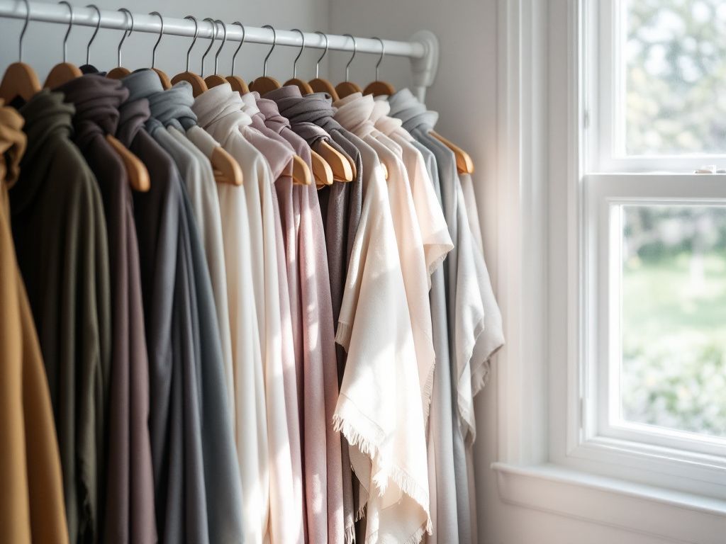
These are real-world textures: fabric, woodgrain, metallic surfaces. You know, the kind you can reach out and touch. They provide a grounded feel and work wonders in printed media and packaging.
2. Visual/Implied Textures
These are a biggie for digital platforms. Think of patterns, brush strokes, or even digital faux-textiles that give the illusion of something tactile. They help to create a façade of texture even when none physically exists, which is especially effective in web design and digital advertising.
3. Abstract Textures
Abstract textures include watercolor splashes, soft geometric patterns, or even noise backgrounds—these add artistic flair and a modern edge to your brand visuals. Not all brands can pull off abstract; they’re exhilarating or risky depending on execution, so proceed with a creative yet grounded vision.
Integrating Texture: Tools and Tips
Ready to get hands-on? Awesome. Here we’ll cover how to bring those textures to life in your brand.
The Texture Style Playbook
Step 1: Define Your Brand’s Emotional Vocabulary
Define what emotions or feelings your brand wants to convey. Comfort? Excitement? Serenity? This shapes what textures are appropriate. Rustic textures will ooze comfort, while metallics might speak to innovation and forward-thinking.

Step 2: Play with the Texture Mix
Here’s where you’ll mix up textures with your brand colors to see how they converse. Seriously, you might feel like an alchemist creating something special.
- Harmony vs. Contrast: Do you want a subtle, harmonious design where textures match your color subtleties? Ideal for a calming or holistic brand vibe. Or do you prefer striking contrast to make everything pop? Good for daring and adventurous identities.
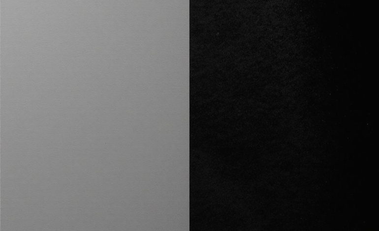
- Light and Dark Textures: These can drastically change an ethos, bringing high drama or serene neutrality.
Step 3: Texture Hierarchy
Textures, if overpowering, can clutter your brand elements. Keep the hierarchy in check by determining what texture style should dominate based on visuals’ roles and the behavioral response you desire.
Step 4: Consistency is Key
Establish consistent texture use across all channels for a uniform brand voice. Even when repurposing formats from print to digital, consistency will ensure that the feel of your brand remains the same across all touchpoints.
Textural Exploration: Example Brand Palettes
Here’s what implementing texture looks like when done with finesse.

Brand Example 1: Eco-Friendly Company
- Color Palette: Earth tones—browns, greens, soft beiges.
- Textures Used: Leaf patterns, recycled paper textures.
- Visual Harmony: The colors and textures echo the brand’s message, creating a cohesive identity.
Brand Example 2: Futuristic Tech
- Color Palette: Silvers, blues, blacks.
- Textures Used: Metallics, carbon fiber, digital circuits.
- Visual Contrast: The sleek, tech-style textures contrast against the solid colors and project innovation.
Brand Example 3: Youth Fashion Retailer
- Color Palette: Bright pinks, yellows, neons.
- Textures Used: Watercolor, paint splatters, graffiti.
- Visual Impact: The vibrant textures scream youthful exuberance and creativity.

Embarking on Your Texture Journey
Listen, don’t hesitate to play around. Creativity loves experimentation, and sometimes it’s the unexpected combinations that end up being the most captivating.
Common Mistakes to Avoid:
- Overuse of Textures: Less is often more. Don’t let textures drown out your primary message.
- Ignoring Versatility: Ensure that selected textures translate well across different mediums.
- Inconsistency: Maintain a pattern that brethren your brand statements across all platforms.
In conclusion, building a texture-savvy brand in 2025 might feel like learning a new language. The key? Embrace the fluidity and dynamism that textures offer—making your brand visuals an engaging pioneer in weaving colors and textures into a functional allure. So go on, dig into those textures, splash them with your brand colors, and unlock a new dimension to your brand identity.
Frequently Asked Questions
What is texture in the context of design and art?
Texture in design and art refers to the perceived surface quality of a material or artwork. It can be either physical (tactile texture), which can be felt by touch, or visual (visual texture), which is perceived through sight. Texture adds depth, interest, and can evoke various emotions and convey different moods and styles[1][3][5).
How is texture used in interior design?
In interior design, texture is crucial for adding interest and depth to a space. It can be used to make large spaces feel smaller and more intimate, or to create a sense of warmth or coolness. Different textures, such as smooth, rough, or patterned, can influence how light is reflected, affect the acoustics of a space, and enhance the overall mood and style of the design[1).
What are the different types of texture in art?
In art, there are several types of texture, including physical (actual) texture, which is the real surface quality of a material, and visual (implied) texture, which creates an illusion of texture through techniques like brushstrokes, lines, and patterns. Other types include impasto, faux texture, and stippled texture, each used to achieve different effects and add depth to the artwork[3][5).
How does light affect the perception of texture?
Light plays a significant role in the perception of texture. It can highlight the peaks and valleys of a textured surface, creating highlights and shadows that enhance the visual texture. Smooth surfaces reflect light well, making colors appear lighter and more intense, while rough surfaces absorb light unevenly, making colors appear darker[1][3).
References- Understanding Texture in Interior Design. Interior Design Student.
- Texture (visual arts). Wikipedia.
- What is Texture in Art — Definition, Examples & Types Explained. StudioBinder.