

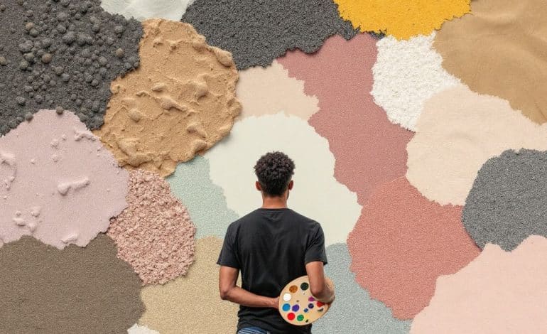
Have you ever stood in front of a shelf of paint samples, utterly overwhelmed by the dizzying array of textures? If you’ve ever contemplated the perfect combination of textures to infuse vibrancy and character into your brand palette, trust me, you’re not alone. This Texture Guide for 2025 is here to demystify the process and help you harness the power of texture style.
Let’s chat about textures. We often overlook them as elements in design, but textures can dramatically transform a brand’s identity, influence perception, and convey emotion. It’s easy to fall into the trap of choosing colors, fonts, and visuals while relegating textures to a dimly-lit corner. But textures deserve a spotlight, so let’s dive into how they can make or break your brand palette.
The Power of Textures
Before we get hands-on, let’s talk about why textures are a big deal. Textures add depth and dimension to what could otherwise be a flat, color-block world. They elevate simple designs, adding layers of meaning. Textures can suggest emotion, indicate luxury, encourage familiarity, or suggest innovation. Picture a sleek tech brand packed with smooth metallic or glossy finishes—versus a rustic organic brand showcasing earthy, tactile textures. See how powerful that is?
Identifying Your Brand’s Texture Palette
How do we start thinking about textures for a brand palette? Don’t worry; it’s simpler than it sounds. Begin by reflecting on your brand’s core values and how you want people to feel when they interact with your brand. Jot these feelings down. Trust me on this one; it’s a real game-changer.
Think about these key questions:

- What feelings do you want your brand’s users to experience? Welcoming? Cutting-edge? Comforting?
- Which elements of your brand narrative are best expressed through texture? Think about authenticity, elegance, sustainability.
Mixing Textures: Striking the Balance
One of the trickiest parts of using texture is combining different styles. It’s like cooking—when done right, a mix can be delightful, but too many conflict and your palette feels cluttered.
- Complementary Textures: Pair contrasting textures to add interest—smooth versus rough, shiny versus matte. They play off each other well, making the design dynamic and exciting.
- Lead with the Dominant Texture: Choose one texture to dominate, and allow others to support with subtlety. This leads viewers to focus while maintaining connection and flow throughout your design.
- Texture Categories:
- Natural Textures: Think wood grains, water ripples, and sand. Perfect for brands with a “return to nature” vibe.
- Industrial Textures: Metallic, concrete, or glossy finishes for a modern edge.
- Fabric Textures: Velvet, canvas, or burlap carry tactile warmth.
Steps for Creating a Texture-Inspired Brand Palette
Now, let’s dive into a step-by-step approach to selecting the right texture style:
Step 1: Research & Inspiration

Start by collecting inspiration. Go on a texture hunt (even a digital one if time is tight!). Catalog visuals for visual texture inspiration—from photographs of natural elements to urban textures or even household items. Ask yourself what feels most connected to your brand values.
Step 2: Textures & Primary Elements Integration
Once inspiration is at hand, pair those textures with existing brand colors, logos, and typography. Evaluate how they interact—do they elevate or detract from your message?
Step 3: Visual Harmony
Achieving a sense of harmony with mix & match textures begins with subtlety. A well-blended palette will include:
- Calm base textures: Cement the design, usually found in backgrounds.
- Accent textures: Inject energy with pops of texture on borders or key elements.
- Neutral connectors: Like unifying intermediaries, they reduce potential clash.
Step 4: Prototyping and Feedback
Before cementing your new texture style, experiment through prototypes. Test these in mock-ups alongside your brand elements. Seek feedback to confirm the combination enhances your brand’s story.

Avoiding Common Texture Mishaps
While textures can drastically elevate a customer’s experience with a brand, there are pitfalls to watch for:
- Clutter Warning: Overusing textures is like writing with too many adjectives. It can confuse or overwhelm.
- Contradiction Clash: Using textures that subtly contradict the brand message might confuse branding narrative. Stay true to agreed values!
- Unconsidered Context: Consider how your textures translate across media—what works on print might not work digitally.

Examples of Successful Texture Pairings
- Apple: Iconic for its sleek metal texture. It underlines innovation while grounding fluency in elegance.
- Patagonia: Uses earthy textures such as roughened textiles to connect consumers with nature — reinforcing sustainability values.
Wrap-Up & Final Thoughts
Texturing your brand effectively takes some practice, a dose of intuition, and a discerning eye. When done right, it creates a tapestry where every thread strengthens the overall picture. As you experiment with your brand palette, remember these flowing, balanced combinations and always circle back to your core brand attributes. Texture style is about making sure your brand isn’t just seen, but felt in a memorable, impactful way.
…And with that, you’re armed with new tools to shape a truly compelling brand experience in 2025. So go out there, embrace the textures—and who knows what brand wonders you might create!
Frequently Asked Questions
What is texture in the context of design and art?
Texture in design and art refers to the perceived surface quality of a material or object. It can be either physical (tactile texture), which can be felt by touch, or visual (implied or simulated texture), which creates the illusion of texture through patterns, colors, or other visual elements[1][3][5).
How does texture influence the mood and style of an interior design?
Texture plays a crucial role in interior design by conveying mood and style. Smooth textures can create a formal, modern, or refined look, while rough or raised textures can add warmth and a more casual, rustic, or industrial feel. The careful composition of texture can also make large spaces feel smaller and more intimate, and it affects how light is reflected, influencing the appearance of colors[1).
What are the different types of texture in art and design?
In art and design, textures can be categorized into several types: actual (or literal) texture, which is physical and can be felt; implied (or visual) texture, which is an illusion created by visual elements; invented texture, which involves using unconventional materials; and abstract texture, which involves using textures in unexpected ways to create contrast and juxtaposition[3][5).
How does texture impact the sensory and functional aspects of a space?
Texture not only affects the visual appeal of a space but also its sensory and functional aspects. For example, soft textures can be pleasant to touch, while coarse ones can be uncomfortable. Additionally, texture influences the acoustics of a space, with uneven and porous textures absorbing sound and smooth surfaces reverberating it[1).
References- Understanding Texture in Interior Design. Interior Design Student.
- Texture (visual arts). Wikipedia.
- The Elements of Art – TEXTURE. Winged Canvas Blog.