

Mastering Color Theory: Creating Harmonious Brand Colors and Hijab Matching
Have you ever stood in front of a clothing rack, contemplating whether you should pair your earthy brown jacket with that purple scarf? Or maybe you’ve toyed with the idea of matching your hijab to those bright orange sneakers, wondering if you’d look bold or just bonkers? We’ve all been there, caught in the whirlwind of “Does this match?” The same question strikes us when creating brand colors—ensuring they’re as stylishly coordinated as your wardrobe.
Before diving headfirst into a spectrum of colors, let’s talk about how color theory plays an essential role in determining what goes where and why. It’s like understanding why red dresses look great on you but painting your walls the same color can be overwhelming. Color theory, dear reader, holds the key to harmonious coordination.
What is Color Theory?
Alright, let’s get to the heart of it. Color theory is more than just putting together red and green because they’re opposites on the color wheel. It’s about balance, harmony, and how colors react to one another. Think of it like a recipe; each ingredient contributes a unique flavor, and the wrong combo can be as jarring as a chocolate-sardine cake. No one wants that kind of contrast in their branding.
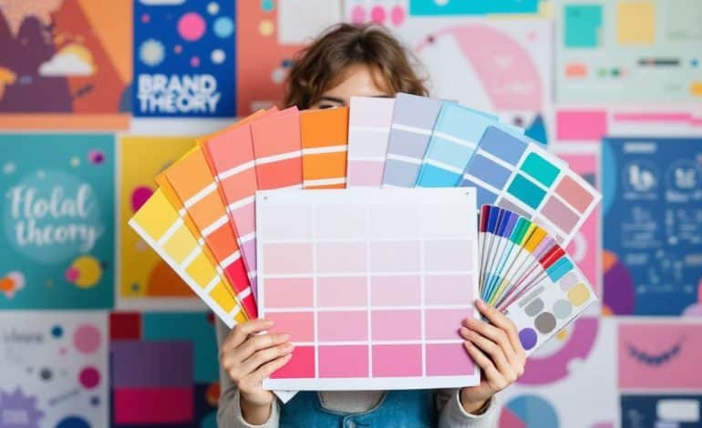
The Basics of the Color Wheel
Picture a spinning pinwheel of hues – that’s your color wheel in action. At its core lie primary colors: red, blue, and yellow. Mix these, and voilà! The secondary colors appear – green, orange, and purple. Blend those further, and you have your tertiaries. Want to look and play like a color sorcerer? Here’s your groundwork.
Understanding Color Harmony
Color harmony occurs when colors blend with each other in a pleasing way. Think of it as choreographing a dance; each dancer must complement the others for a spectacular performance. Similarly, harmonious colors create a perfect symphony that doesn’t overpower or overshadow.
- Analogous Colors: These sit next to each other on the wheel. Picture a cozy fall ensemble—deep oranges with rich reds and snug browns. They’re neighbors sharing a fence.
- Complementary Colors: Located across from one another. Just like that classic blue and gold university logo that screams bold confidence.
- Triadic Colors: Equidistant and form a triangle. Brim with diversity and vibrance; think The Simpsons—blue, red, and yellow.
Matching Brand Colors: The Art and Science

Now, you’ve got the basics, but there’s an art to tying these concepts into something tangible like your brand’s identity. Your brand isn’t just a fancied-up title; it’s a persona, a voice. Picking out clothes for an old friend, you kinda know what makes ’em look phenomenal. Same goes for wearing your own vibe through well-matched brand colors. Here’s how you get started.
Color Psychology—What’s The Mood?
Colors have personalities—yup, like people. Red shouts determination, while blue whispers tranquility. Recognizing these traits is pivotal in choosing brand colors that resonate with the message you’re trying to project. Use this smartly.
- Red: Energy, passion. Perfect for brands wanting to convey dynamism or urgency.
- Blue: Trust, professionalism. Ideal for institutions aiming to establish reliability.
- Green: Growth, rejuvenation. Common among ecological or finance brands promoting stability.
Evaluate your brand’s core message and what emotional response you’re trying to elicit—cue the psychology of color.
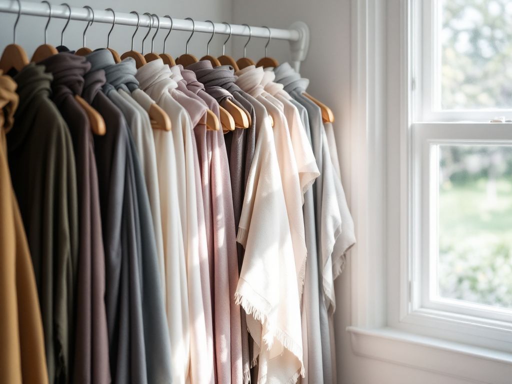
Defining a Color Palette
Let’s make things fun. Walk with me through laying out a color scheme akin to dressing for a themed party.
- Base Color: Like the backbone of a palette, it’s grounding and sets the mood. Think beige couches and jeans—steady and versatile.
- Accent Colors: Add flair, much like statement jewelry. Be strategic and selective, focusing on hits rather than saturation.
- Neutral Colors: These keep everything crisp. They hold their place on brochures, business cards, and marketing materials without screaming for attention.
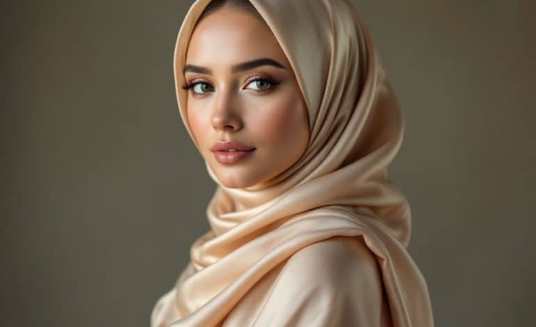
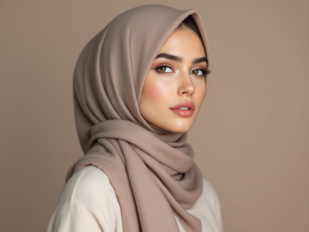
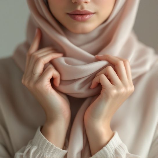
Hijab Matching to Your Brand

Imagine adapting your favorite outfit to match your brand—maybe a matching hijab that doesn’t just complement your scarf but echoes your logo’s essence. Alignment matters, leveraging your brand colors into all facets of your persona aligns your visual identity like an orchestra perfectly in tune.
Translating Theory to Action
Right, theory’s handy, but how does this play out in the wild world of brands? Let’s get practical, shall we?
Step-by-Step: Building Your Brand’s Color Scheme
- Identify Key Message: Determine what your brand wants to say with color. Cool and calm? Bold and authoritative? Pinpoint it.
- Research Competitors: Before settling, glance at what competitors use. It’s not about blending in but standing recognizable and distinctly your own.
- Choose the Primary Hue: Pick a foundation that represents your core message. Wrap yourself, or your packaging, snug in this.
- Select Secondary Colors:
- Balance this choice with analogous tones for subtlety.
- Or go complementary for high energy—sparks that don’t start fires, trust me on this.
- 5. **Test on Mediums: Once selections are made, test it all. Print, digital, fabric—see how it wears in different lights and mediums. There’s often a surprise—a color that plays well on screen may sulk on fabric.
Key Mistakes to Avoid

You might slip once or twice, but hey, learn from them. Here’s what could trip you up.
- Ignoring Contextual Use: That neon green logo glows in daylight but might startle in night lighting. Be wary!
- Overloading Colors: More isn’t always merrier. Use restraint. Burdening your palette is akin to wearing all your jewelry at once—overwhelming and disjointed.
- Disregarding Accessibility: Ensure your colors speak to all audiences. This includes people with vision impairment. Contrast is crucial.
Reinforce Like a Pro
Good things bear repeating. Let’s circle back: your brand colors, when harmonized elegantly, reflect your identity unspoken—a professional flair that loiters in the client’s mind for the right reasons. While your palette sings, an unusually matched hijab or coordinated ensemble exemplifies understanding of self-branding. Outfits connect visually just like strategic, thoughtful color palettes do.
Remember, color coordination goes beyond aesthetic; it’s essence-capturing whether swathing your logo or embracing your hijab. Imbuing soul into shapes and lines—that’s your work of art.

Wrapping it Up
This guide isn’t just a read-through. Treat it as your gritty, colorful teammate guiding you into harnessing the magic of brand colors along with an occasional wardrobe inspiration. By weaving together color theory and practical application, you’ll dress your brand the way it deserves—a reverent reflection, vibrant as the morning sun yet graceful as a whisper.
So, summon your inner Picasso or Marie Kondo, tidying hues until your brand’s aura glows. Embrace the unexpected, keep harmony center stage, and paint your world without regret. Let’s get to coloring.
Frequently Asked Questions
What are the key principles for matching hijab colors with an outfit?
When matching hijab colors with an outfit, it is important to consider principles such as going monochromatic, using complementary colors, and limiting the number of colors. A monochromatic palette involves wearing different shades of the same color, while complementary colors are those opposite each other on the color wheel, creating a visually appealing contrast. Additionally, keeping the colors limited and balancing textures can enhance the overall look[1][3][4).
How can I match a printed hijab with a printed outfit?
To match a printed hijab with a printed outfit, follow rules such as wearing something solid to break up the prints, keeping the prints in the same plane, and ensuring the colors are in the same family. This helps prevent the look from becoming overwhelming and maintains a cohesive appearance. For example, pairing a printed hijab with a solid top or using a white collared shirt to break up the prints can create a balanced look[4).
What is the benefit of wearing a matching cap under the hijab?
How can I choose complementary colors for my hijab and outfit?
Choosing complementary colors involves selecting colors that are opposite each other on the color wheel. Examples include green and pink, purple and yellow, and blue and orange. When these colors are combined, they create a contrast that makes each color look more vibrant. For the best results, use one shade for most of the outfit and include the other shade in only one piece, like the hijab[1][3).
References