

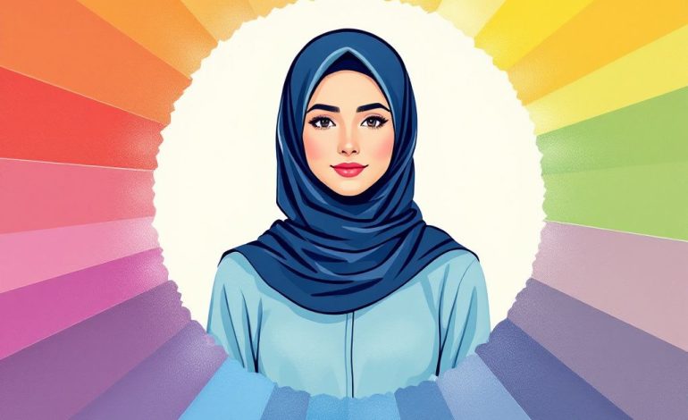
Harmonizing Colors for Your Hijab Brand Palette
Hey there! Ever found yourself staring at a frustratingly blank canvas, pondering how on earth you’re supposed to choose the perfect color palette for your brand? Trust me, you’re not alone. Picking the right colors can sometimes feel like finding a needle in a haystack. You want harmony, not chaos, and definitely nothing that screams “I had no idea what I was doing!” So let’s chat about how to achieve color harmony and how it effortlessly enhances your brand’s hijab matching aesthetic.
Why Does Color Harmony Matter?
First things first, color isn’t just about looking pretty—though that’s a major bonus. Color harmony is essential because it creates a visually appealing narrative for your brand. It sets the mood, tells a story, and whispers sweet nothings to your customers, without ever saying a single word.
Picture this: you’re launching a fabulous hijab collection and your branding shouts confidence, elegance, and creativity. But if your colors are screaming instead (and not in a good way), your message will get lost in translation. When colors harmonize, they’re naturally pleasing to the eye. They make us want to engage, explore, and stick around a little longer.
Get to Know Your Colors
Let’s kick it off with a little color theory. Understanding color—its variations and relations—is key to picking the right hues for brand palettes.
1. Primary Colors
You know these guys: Red, Blue, and Yellow. They are the foundation of the color wheel and, by mixing them, you can create pretty much every other color under the sun.
2. Secondary Colors
Mix those primary colors up, and you get your secondary palette: Green, Orange, and Purple. These are the bridge-builders in your color scheme.

3. Tertiary Colors
Now for a little twist—combine a primary color with a secondary color next to it, and say hello to the tertiary colors: Yellow-Orange, Red-Orange, Red-Purple, Blue-Purple, Blue-Green, and Yellow-Green.
Working with Color Harmonies
There are different ways to achieve harmony—like different dance styles at a party. Let’s explore the main color harmonies that can serve your brand well.
Monochromatic Scheme
Here, you stick to one hue and dabble with its lightness and saturation. Imagine a spectrum from dark navy to sky blue—soothing, right? Great for brands that want to be calm, consistent, and classy.
Complementary Scheme
Dial up the drama with colors opposite each other on the color wheel. Think vibrant red and lively green. This pairing adds pop and interest, sure to turn heads if that’s your brand’s vibe.
Analogous Scheme
Choose colors that sit next to each other on the wheel, like yellow, yellow-orange, and orange. Analogous schemes feel almost like best friends who spill from one into the other effortlessly. Warmth and cohesion are what they are all about.
Triadic Scheme
For a vibrant junction party, this is your pick. Imagine a triangle on the wheel, like red, blue, and yellow. It’s balanced yet vibrant and works wonders for brands looking to emphasize energy and zest, especially with your hijab matching!
Split-Complementary Scheme

Meet subtlety and sophistication. It takes a base color and pairs it with two adjacent secondary hues of its complementary. If you’re ever in doubt, trust this one.
Drawing Inspiration for Your Brand Palette
When you think of color inspiration, it’s crucial to consider both your brand’s values and the emotions you want to evoke. Take cultural aspects or feelings your products represent. Here’s how you pick up hints on what might resonate:
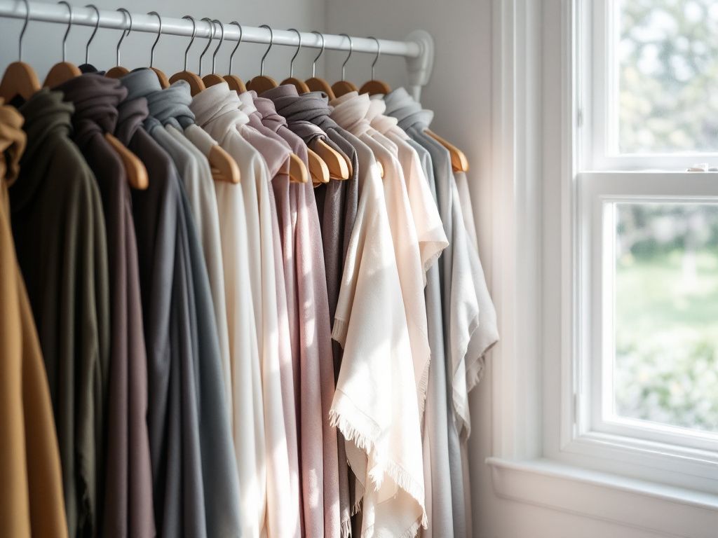
- Mood Boards: Grab images, textures, and other inspiring elements that represent your brand and pile them into a collage.
- Nature: Look at nature around you for some unforced beauty. The soft palette of a sunset or spring blooms can offer timeless color dynamism.
- Cultural References: Appreciate styles from different cultures and what hues they signify; often, these connect deeply on an emotional level, especially when incorporating cultural elements like hijab matching into your brand.
Integrating Colors into Your Brand
Now that you’re armed with color knowledge, how do you incorporate it? Begin by weaving your colors seamlessly across all channels. From logos to banners, to products—consistency is key. Here’s a simplified way:
Step-by-Step Process:
- Identify the Core Message: Is your brand playful, elegant, or adventurous? Your color needs to speak this language.
- Choose a Primary Color: This will serve as your color anchor. Maximize impact, minimize chaos.
- Select Secondary Colors: Assist your primary color and reinforce the brand’s feel.
- Test with a Small Palette: Start with a prototype or a mood board and see how things vibe.
- 5. **Finalize with an Accent Color: Choose one or two accent colors for those extra bursts of life and to complement your main hues.
Getting Feedback

Alright, so you’ve put together what feels like a masterpiece but remember—design is subjective. Get a second set of eyes on your work. Gather a few folks who represent your audience, maybe some designers or creative thinkers. An open dialogue often unveils things challenging to do alone.
Avoiding Common Mistakes
Now before wrapping things up, let’s quickly ensure you’re one step ahead of common pitfalls.
- Color Overload: So many fab options, so little space. Keep it simple. Stick to a core trio or quad—this eliminates confusion.
- Trendy Traps: Just because something’s in vogue doesn’t mean it’s the right fit. Ensure your choices align with long-term brand goals and values.

- Ignoring Accessibility: Contrast is crucial. Make sure text is readable and welcomes everyone to the party.
Embracing Your Unique Brand Identity
Colors help solidify your brand’s position and personality. They invite people into your world, reflect who you are, and narrate your unique story. Remember, when done right, your audience feels this same coherence resonating with them—it’s like finding that perfect shade that makes your hijab matching sing!
Ah, the sweet harmony of colors aligning. Isn’t it beautiful? Play around! Experiment and refine. Give it the time it deserves. Before you know it, you’ll notice you have distinct, powerful color harmony breathing vibrant life into your brand’s vision. Your palette will convey emotion, captivate your audience, and turn casual browsers into loyal followers.
Wasn’t this a fun dive into the world of colors? Hopefully, you found these tips as delightful and useful as that spin-off moment when you realize how spot-on your choice was. So go on, bring back the vibrancy and elegance to your brand with colors that truly represent your vision. Trust me, your brand and your hijab matching lovers will thank you!
Frequently Asked Questions
What are the key principles of hijab color matching?
Hijab color matching involves several key principles, including going monochromatic, choosing complementary colors, and limiting the number of colors used. Monochromatic involves wearing different shades of the same color, while complementary colors are those opposite each other on the color wheel, creating a visually appealing contrast. It’s also important to match prints correctly and balance contrast and complement in your outfit[1][5].
How can I choose complementary colors for my hijab?
Complementary colors are those that are opposite each other on the color wheel. Popular pairs include green and pink, purple and yellow, and blue and orange. To use complementary colors effectively, choose one shade for most of your outfit and include the other shade in a single piece, such as the hijab, to avoid symmetry and create a balanced look[1][5].
What is the benefit of wearing a matching cap under the hijab?
How can I balance contrast and complement in my hijab and outfit combinations?
To balance contrast and complement, it’s important to strike a harmonious chord between the two. Too much contrast can steal the spotlight, while an absence of complement can leave the ensemble feeling incomplete. Use contrasting colors to add spice and complementary colors to bring a touch of unity, ensuring your outfit is both eye-catching and tastefully balanced[5].
References- Hijab Colour Combination: 7 Tips for Colour Matching. Youremma.
- Hijab With Matching Caps: Comfort, Style, and Modesty. Hikmah Boutique.
- Contrast or Complement? Decoding Color Matching for Abayas and Hijabs. Onyx Abaya.